These Tests Will Tell You Whether it’s Time for a Website Redesign

Is your website design begging for retirement?
That’s a complicated question – and one that we’re happy to help you answer. In fact, there are a series of straightforward tools you can use to start diagnosing your site’s issues and considering whether they outweigh its strengths.
Deciding on a redesign should have you considering site appearance, function, and versatility – and identifying which realm (or realms) your site is lacking.
Looking for an expert’s eye? Request a complimentary website evaluation and we’ll provide an outside opinion as to areas for improvement. Sometimes, bringing in a stranger to take a look at a site you know so well reveals hidden problems that are begging for a fix.
Common Aging Website Problems – And the Tools to Identify Them
Poor Website Load Speed
When a website takes forever to load, a few things happen. One, the site visitor gets irritated and takes off without ever engaging with your site. And two, the search engines take this as a signal that your website is low quality – and alter their rankings to reflect that.
Site speed is always going to be crucial from both a user and bot perspective. And with our increasingly all-encompassing use of the internet, it’s only going to get more important.
So: how fast is your site? And is that fast enough to satisfy 2017’s demands?
The first tool to check out is Google’s Pagespeed Insights. Some of the factors they take into account are a little finicky, but the tool will give you an overall understanding of whether your site is sluggish. Then, check that score against a Pingdom speed test. We like this tool because it’s not logged down in Google-borne biases, and also compares your sites to others that have been recently tested to give you an idea of how it’s measuring up.
Technical Errors / 404’s
Are some of your site pages dead ends? If your site is old, it’s possible that some of the images and pages are no longer up and running. There may also be issues with certain browsers or devices.
In order to see exactly where users are hitting 404 errors, set up your website with Google Search Console. It’s easy to configure and will give you specific listings of which pages are throwing errors. All you need to set it up is access to your website’s registration account or the site files – here are some quick instructions.
Difficulty Navigating Website
If you can’t find what you’re looking for on your own website, there’s a bigger problem at hand. You want visitors, especially new ones who have no experience with your business, to be able to quickly arrive at their desired piece of information. But bulky (or overly minimal) menus get in the way, as do pop-ups and other distractions.
We wrote a post about site navigation last month – check it out for some specific pointers.
Non-Mobile Responsive Design
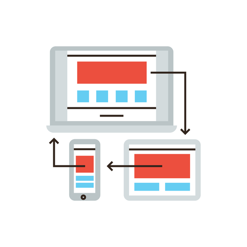
This is an absolutely huge consideration – especially in today’s SEO landscape. Simply put, if your website isn’t responsive, it’s not going to rank. What does it mean to be responsive? All elements on your website should resize and realign based on the screen size and device that it’s being viewed on. This allows for the best possible user experience – and less zooming, reloading, and frustrated abandonment of the site.
Google has another tool that allows for easy peasy evaluation of responsiveness – try out the Mobile-Friendly Test.
Outdated Design
This takes a bit of subjectivity – there’s no simple test you can run your site through to get a thumbs up or thumbs down on how current it looks, unfortunately. But what you can do is try to take an objective look at your home page. Compare it to other websites that you frequent on a regular basis – does it look like it was built in the same era?
Design trends change extremely quickly, and it doesn’t take long for a site to start looking like it was built years ago. That’s one reason why avoiding trendy design tactics and sticking to something tried-and-true can be a good approach, especially if you don’t want to keep having to invest in new designs.
Looking for help coming to a redesign decision? Just get in touch!
