
Category: Blog
You did it. You took the first step toward getting new patients through Facebook advertising, and figured out the campaign objective for your new ads. You triumphantly chose “Traffic” or “Brand Awareness” or “Engagement” and clicked through to the next screen…
Only to be met with this absolute nightmare.
With this many options, how can you figure out exactly what’s right for your practice? Who is your ideal ad audience, anyway?
Take a deep breath – and keep reading. Below, I talk through this process step by step to identify the key components of this messy Ad Set screen, and how you can come out on the other side with a nicely sized audience that makes sense for your campaign objective.
Hold on, what’s an ad set?
First off, I’m going to interrupt myself to provide a little more information about the anatomy of a Facebook campaign. Knowing these three components by name will save you some headaches down the line.
- The campaign is the umbrella under which the ad sets and ads live. The campaign is determined by the campaign objective (Conversions, Brand Awareness, Video Views, etc). This is the broadest component.
- The ad set is the part of the campaign that will be delivered to a certain audience. You can have multiple ad sets in a campaign to target different types of individuals with the same ultimate objective. Different ad sets might target one location vs. another, individuals who have visited your website before vs. those who have not, or a thousand other permutations that we’ll discuss later in this post.
- The ad is the post that will be shown to the ad set’s audience. This is the smallest piece of the Facebook campaign, and is the component that targeted individuals actually see and interact with.
Questions to ask yourself before creating your first ad set
What’s your campaign objective?
Although you’ve already chosen your objective, keep it in mind as you approach your prospective audience. Who is going to be the most likely to successfully interact with that objective? Here’s an example. If your objective is Video Views or Brand Awareness, you’re likely advertising to individuals that are unfamiliar with your practice. On the other hand, if your objective is Conversions or Leads, you’re likely advertising to individuals that have connected with you before. What does that unfamiliar audience look like, vs. the familiar one?
Is this a campaign that you’d like to show a more general audience vs. someone specific?
This is a bit of a trick question. In my opinion, every campaign should have a specific audience. Facebook makes it all too easy for you to cast an overly wide net because their main goal is for you to spend money on their platform, and a bigger audience means a more expensive campaign. But a bigger audience doesn’t also correlate with a better response. Ad leads that are physically too far from your office, or uninformed about a procedure, are likely to be unresponsive to your staff’s attempts to book their appointment and get them into the office. There’s nothing more frustrating than spending ad dollars on a lead, then losing additional resources through your staff taking the time to call and email them without ever getting a response.
Even in a situation where you’re just desperate to get the word out about your practice, you should never go for a blanket “my location + 20 mile radius” as your sole means of targeting. This is going to cast too wide a net, so that you spend advertising dollars collecting individuals that aren’t ultimately going to be ideal clients (or ever really connect with your office).
So what should a more general campaign look like? Start broad and then add in shades that will narrow your scope. There’s a big difference between a highly specific, small audience and a broader but still targeted audience. The former is typically very precise and often related to the prospect’s past interactions with your ads, website, or Facebook page (more on that below). The latter is typically bringing in a cold audience, who has not interacted with your practice before – but is primed to be a good fit.
Take a look at the following to guide your ad targeting –
- Consider your target audience’s interests. What have they recently been searching for / showing interest in online? Are they parents, what are their professions, what are their income demographics?
- Look at a map using a radius tool and ask yourself, realistically, how far prospects would be willing to travel to visit your office. Facebook also offers the option to target by a group of locations without radii, which can be useful when there are areas in your immediate radius that you’re not interested in targeting.
- Consider the offer you’re putting forth in the ad. Is this something that is going to be appealing to an outsider who has not had any contact with your practice, or are they unlikely to see the appeal? You want to develop your ads so that the audience at the top of the funnel is shown an easy-to-understand offer. Then those who interact with the ad / offer but don’t actually convert are guided on to the next step in the funnel, where they receive a more detailed offer for a service or product that they’ve already been educated about. The top of the funnel audience is more broad, and the middle and bottom of funnel audiences are more defined.
Who is a specific individual you’d like to see your ad?
Now is the time to determine your ideal buyer. We touched on this in the previous section, but there are a few specific factors you’ll want to consider, including –
- Age – can choose a range between 13 and 65+
- Gender – can choose all, men, or women
- Languages – can choose any language
- Demographics – parents, married vs. single, education level, profession, income level
- Interests – online activities, pages they’ve liked, and related topics
- Behaviors – purchase intent, purchase behaviors, devices used
- Connections – people who like your business’ Facebook page (can include or exclude), friends of people who like your page
Once you’ve thought through each of these, congratulations! You have articulated your buyer profile.
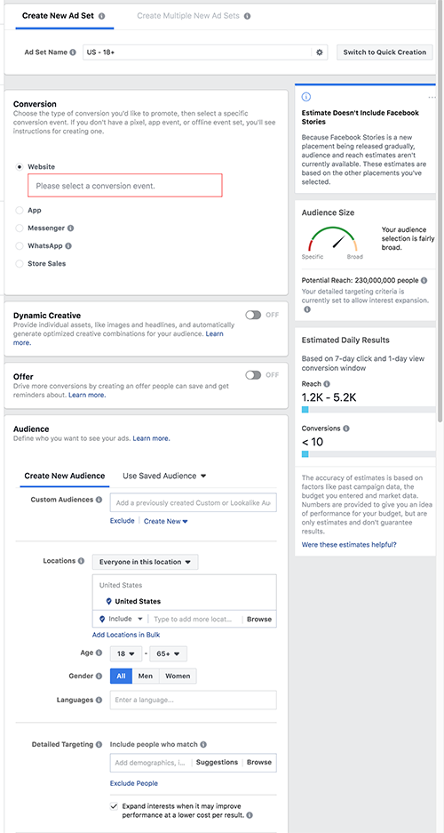
Now to get down to the nitty gritty – how do you actually set up these restrictions on the ad set page?
How to Define Your Ad Set Targeting Options in Facebook’s Ads Manager
Location
There are a few different options in the location section alone, and it can be a bit tricky to understand.
First of all, you need to decide whether you’ll be targeting:
- Everyone in the specified location
- People who live in the specified location
- People recently in the specified location
- People traveling in the specified location
If you’re unsure of which might make the most sense for your practice, just choose option#1.
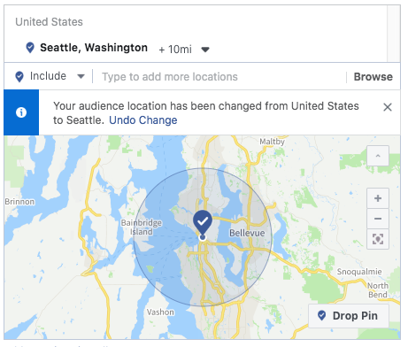
Next, you’ll set the location itself. Click inside the location box and type in the city you’d like to target, then adjust the radius to the appropriate number of miles. The map will update to show you what that area will include.
Also, if you’re interested in targeting the specific city but not a radius, click the “+10 mi” section to bring up this menu: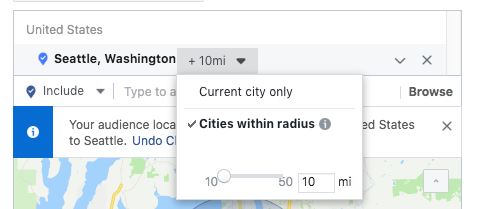
You can then switch to “Current city only.” If you’d like to target a group of cities, you can click “Add locations in bulk” at the bottom of the map to do so quickly and not need to enter them one by one.
Age
Select an age range that reflects your ideal customer or patient.
Gender
Choose whether you would like to target men and woman (“All,”) or either men or women.
Languages
Choose the languages that you would like your targeted audience to speak.
Detailed Targeting
This is where things get a little overwhelming. There’s a whole lot in the detailed targeting box, but once you start making choices you can take advantage of the helpful “Suggestions” feature to bring up additional relevant options instead of needing to sift through absolutely everything.
Let’s say I want to target new parents – I type “parents” into the bar and receive these options.
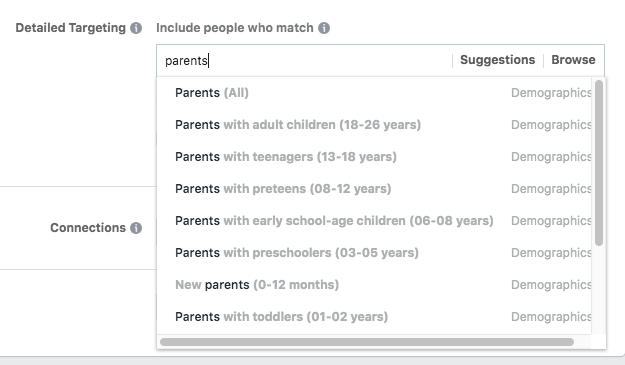
I’m interested in new parents only, so I select “New parents (0-12 months).”
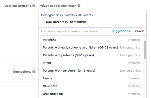
Now that this selection been added to my targeting, I can click “Suggestions” to pull up related interests, demographics and behaviors that might be useful for my audience –
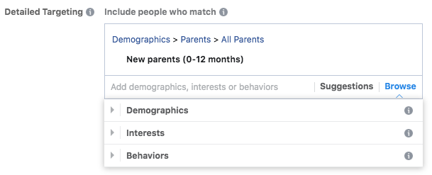
You can also click “Browse” to view an organized menu of all your options, which is useful if you’re just getting started with ad targeting and not quite sure what to search for. These are organized under the umbrellas Demographics, Interests and Behaviors.
One more thing in this section – don’t overlook the Exclude or Narrow Audience options below the targeting search window.
- Exclude – Chances are, you’ll almost always want to be making exclusions to your ad set. For example, if you’re hoping to target individuals whose recent activity indicates an interest in getting dental work done, you’ll want to exclude people who are in the dental profession as those aren’t prospective patients.
- Narrow audience – This option allows you to add additional behaviors, interests or demographics that must be shared by the group you’ve defined. This helps refine the overall audience.
Connections
Choose whether you would like to include or exclude people who like your business’ Facebook page, or include friends of people who like your page (which can provide a valuable audience).
Save This Audience
You’ve put all the hard work in – be sure to save this audience with a descriptive name so that you can use it in future ad sets without needing to redo the legwork! While you can always duplicate ad sets to use in the future, I like to save individual audiences so that I can grab them whenever I need.
Audience Size
You’ll notice a live-updating area on the right hand side of the Ad Set creation screen with the title “Audience Size.”
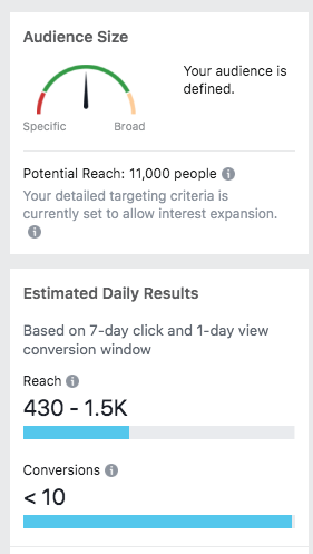
This helpful section is important to keep an eye on as you refine and narrow your audience. The meter at the top will give you an idea of whether your audience becomes too small for ads to regularly be shown. The estimated daily results provide a rough estimate of the kind of results you might have with the size of your audience and the budget that you set. Remember, these figures aren’t necessarily accurate – they just provide a general idea of what you can expect to see once that ad set has been running for a week.
Custom Audiences
There’s a huge component of your audience that we haven’t even delved into yet – custom audiences. These audiences can be incredibly useful, as you can use them to target niche groups of individuals that may make the most sense for your practice – from recent website traffic to your existing database. But because creating these audiences can be a bit technical, I’m saving this for our next post.
Feeling overwhelmed by the prospect of managing your own Facebook campaign? That’s what we’re here for. Get in touch with details on the campaign you’d like to run and we’ll take care of everything you need – and deliver new business to your office. Reach out today!
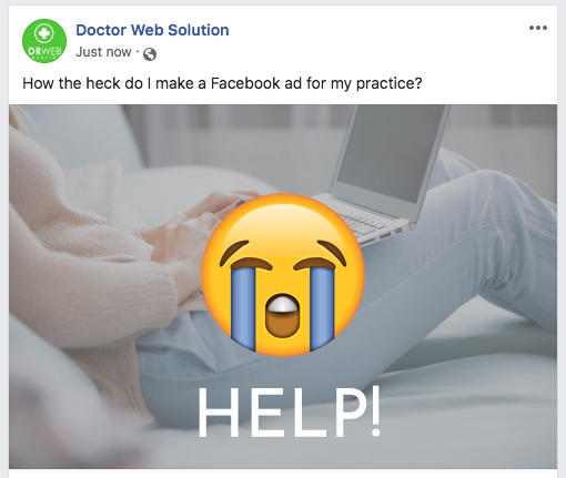
It’s the late winter lull. Your schedule is feeling a little light. You’d love to get some extra patients in the door – and Facebook ads seem like a good option for increasing online lead volume. But you’re at a complete loss as to where to begin, or where to turn for advice that makes sense for your own practice.
Sound familiar? You’re absolutely not alone. While Facebook can be an incredibly beneficial advertising platform, it can also be a real headache to break into. And because Facebook is happy as long as you’re spending money, the platform itself isn’t always the best source of actionable advice.
Hopefully, this post will be a bit more helpful. This is part one of our Facebook advertising for healthcare professional blog series. This week, we’re tackling the first steps toward getting a Facebook campaign up and running – understanding the campaign objectives that might make the most sense for your practice.
Best Facebook Campaign Objectives for Dentists & Doctors
You have your Facebook ad account ready and you’re itching to create your first ad. You click “+ Create” to pull up your first campaign – and this screen comes up.
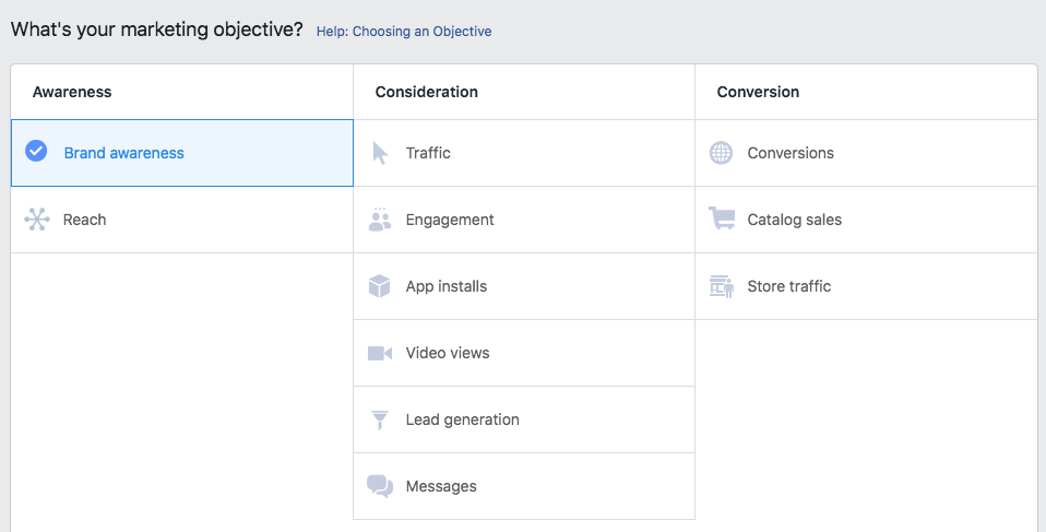
….Now what?
While some of these are more self-explanatory than others, they all have a time and place – and our job is to decipher when and where that is. Some objectives are glaringly unhelpful for most healthcare professionals (App Installs and Catalog Sales, for example), but others are subtler. How to choose between Brand Awareness and Reach? Or Traffic and Engagement?
We’ve broken down some of the most useful medical and dental Facebook campaign types below to make things a bit clearer.
Brand awareness
This objective shows your ad to people who are likely to recall it and remember your brand in the future. This is ideal for new practices and small businesses who are trying to get the word out in their local area, and less helpful if you’re hoping to actually drive conversions and website traffic.
Traffic
The traffic objective drives traffic to your website or landing page to in turn drive conversions. Traffic ads are versatile and can also be optimized for “landing page views,” which helps Facebook show them to individuals who are more likely to view your landing page / ad destination. Traffic ads can also be used to create remarketing audiences – groups of people who have visited your website but haven’t converted, who are warmed up and more likely to convert in the near future. We’ll go into remarketing in more detail in a future post in this series!
Engagement
This objective shows ads to individuals likely to engage with the ads – to like/react to them, view your Facebook page, share the ad post, or otherwise interact with that content. Enagement ads can be useful for practices hoping to build their Facebook following or promote an event or limited offer (referral program, contest, temporary special).
Video views
This objective puts your video content in front of users who are likely to watch more of the video. This objective is widely used to build remarketing audiences, as well as increase page interaction and brand awareness, so there’s some overlap with other objectives.
Lead generation
This objective creates a form directly on Facebook that users can submit to indicate interest in a specific treatment or special offer. Lead ads have a unique advantage in that they prefill the user’s information from their Facebook profile, so as little effort as possible is required in order for the lead to share their details with your office. The downside is that this means lead ads tend to attract users with minimal interest in actually following through and booking – they may not even remember submitting the form when your front desk reaches out. Another tricky component is that you’ll need to set up an outside integration in order for the leads’ information to be sent to you (there’s no email notification or Facebook notification option).
Messages
This objective encourages ad viewers to send your office a message. The messages objective can be very useful when you’re promoting a treatment that isn’t well known, or is otherwise likely to bring up questions. You will need to have a staff member paying attention to the practice’s Facebook page so that they can answer these in a timely fashion – messengers tend to expect a speedy response. You can also set an auto-reply that provides a link with more information.
Boost Post
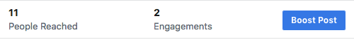
Observant readers will notice that this objective wasn’t included in the Facebook campaign screenshot above. Yet it’s actually the objective that most small businesses use – at least early on in their advertising journey. Why? Because it’s built into the business page itself.
When you finish writing a great post and publish it to your business page, you’ll notice a “Boost Post” button in the lower right hand corner.
Click this, and you’ll pull up a window with quite a few targeting options and questions about where you’d like to show the post. The important part here is the Objective section –
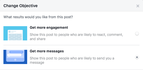
You’ll notice similar options to objectives we’ve already detailed above, namely Engagement and Messages.
The reason post boosts are so popular is because they feel much easier to set up for someone not acquainted with Facebook’s Ads Manager interface (which can definitely be a doozy to navigate). But because boost options are more limited, it’s not always the right route to take.
When is a boosted post the right bet? If you have an already popular post on your page that you’d like to share with a wider audience, it’s a great option.
What Next for my Facebook Ad Campaign?
This is just the tip of the iceberg, but we’ll be back with more information soon. Next up is ad targeting – what makes sense, what’s excessive, and where Facebook might try to trip you up into overspending for diminishing returns.
Tired of reading endless Facebook ad advice? Get in touch with our team for a comprehensive Facebook advertising solution. We’ll take care of ad content, your landing page, your campaign setup and everything in between. Reach out today for a complimentary consultation of your website and details on which ad campaigns might be ideal for you.

Organic search engine optimization is all about making your website appealing to search engines – and snagging new visitors in the process. With the thousands (millions?) of SEO recommendations floating across the internet, it can be tricky pinning down exactly what’s going to make a difference. That’s just one reason why it always pays off to just pay attention to what’s currently working – and do your best to imitate the approach.
Google has us all in its thrall – but we’re not entirely powerless. There are definitive steps website owners can take to stand out among the pack. And featured snippets are probably the coolest payoff for properly-optimized, high quality website content.
What’s a Featured Snippet?
A featured snippet is the block of text above the list of regular search results that displays a relevant excerpt from the linked page. This is technically a search result, but it takes precedence over everything else on page 1 for a few reasons. One, it actually delivers a block of information, rather than linking the searcher to the website itself. And two, it’s the first thing you see on that page of results (with the exception of ads, which are always going to rise to the top because they’re a moneymaker for Google and other search engines).
Here’s an example of a featured snippet that answers the searcher’s question about tooth decay:
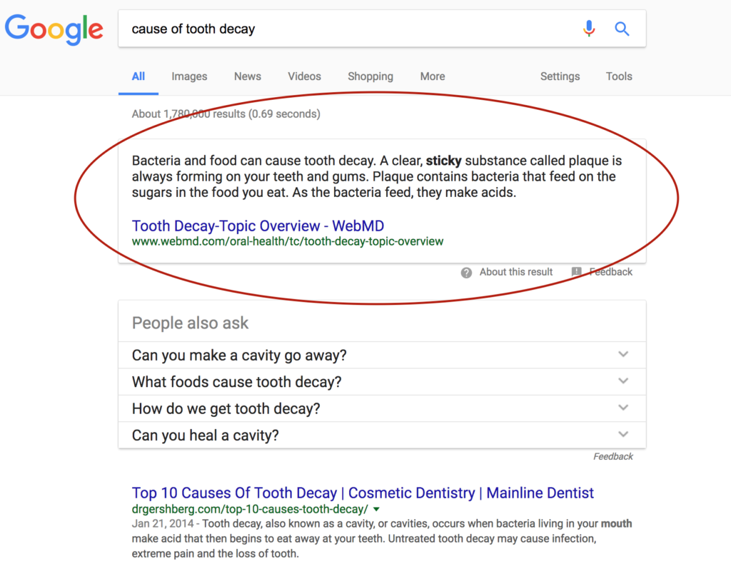
There’s more than just a single featured snippet, here – the list of related questions all open out to show additional featured snippets, with blurbs from sites above linked URLs.
Then, there’s the first of the standard search results – a link to a private practice’s site that has an informative and easy-to-read piece on common causes of tooth decay.
Featured snippets are Google’s way of getting searchers the information they’re looking for as quickly and easily as possible. As the behemoth continues making choices that enforce their commitment to a higher quality internet, we can expect additional user-oriented results that prioritize searcher intent.
So How Do I Get Featured Snippets for My Practice Website?
Take a look at your website and consider whether there’s room to work on the following:
- Use of targeted keywords and strategic content – If you’re a dentist with a single office, you’re most interested in marketing your services to the immediate area. But plastering your site pages with variations on “Chicago dentist” keyword phrases isn’t going to yield great results – it might even get you penalized. More importantly, those searching for “Chicago dentist” are likely more interested in location and convenience than viewing site content. Instead, you can capitalize on more popular phrases that are going to lead to real (and engaged) site traffic. Consider what searchers looking for dental advice might be typing, and build content around those phrases. Building a page about the causes of tooth decay, like the dentist below the featured snippet in the graphic above, isn’t a bad place to start.
- Q&A pages – Because so many search queries are questions or pieces of questions, building out an FAQ or Q&A page (or, even better, multiple pages organized by topic) is a great strategy. Be sure to mark the questions as headings and the answers as paragraphs to capitalize on snippet optimization (more on that below).
- Appropriate formatting – Diving up pages with subheadings, lists, tables and other HTML formatting that better communicates with search engines will help them understand where to pull from and increase your likelihood of being in a featured snippet. From basic SEO optimization to snippet-specific formatting, there are plenty of opportunities for adjustments.
Where Do I Even Begin with Snippet Optimization?
Don’t get overwhelmed – get active. If you’re looking for professional help, submit your website for a free evaluation and we’ll help you decide on next steps.
Is your website design begging for retirement?
That’s a complicated question – and one that we’re happy to help you answer. In fact, there are a series of straightforward tools you can use to start diagnosing your site’s issues and considering whether they outweigh its strengths.
Deciding on a redesign should have you considering site appearance, function, and versatility – and identifying which realm (or realms) your site is lacking.
Looking for an expert’s eye? Request a complimentary website evaluation and we’ll provide an outside opinion as to areas for improvement. Sometimes, bringing in a stranger to take a look at a site you know so well reveals hidden problems that are begging for a fix.
Common Aging Website Problems – And the Tools to Identify Them
Poor Website Load Speed
When a website takes forever to load, a few things happen. One, the site visitor gets irritated and takes off without ever engaging with your site. And two, the search engines take this as a signal that your website is low quality – and alter their rankings to reflect that.
Site speed is always going to be crucial from both a user and bot perspective. And with our increasingly all-encompassing use of the internet, it’s only going to get more important.
So: how fast is your site? And is that fast enough to satisfy 2017’s demands?
The first tool to check out is Google’s Pagespeed Insights. Some of the factors they take into account are a little finicky, but the tool will give you an overall understanding of whether your site is sluggish. Then, check that score against a Pingdom speed test. We like this tool because it’s not logged down in Google-borne biases, and also compares your sites to others that have been recently tested to give you an idea of how it’s measuring up.
Technical Errors / 404’s
Are some of your site pages dead ends? If your site is old, it’s possible that some of the images and pages are no longer up and running. There may also be issues with certain browsers or devices.
In order to see exactly where users are hitting 404 errors, set up your website with Google Search Console. It’s easy to configure and will give you specific listings of which pages are throwing errors. All you need to set it up is access to your website’s registration account or the site files – here are some quick instructions.
Difficulty Navigating Website
If you can’t find what you’re looking for on your own website, there’s a bigger problem at hand. You want visitors, especially new ones who have no experience with your business, to be able to quickly arrive at their desired piece of information. But bulky (or overly minimal) menus get in the way, as do pop-ups and other distractions.
We wrote a post about site navigation last month – check it out for some specific pointers.
Non-Mobile Responsive Design
This is an absolutely huge consideration – especially in today’s SEO landscape. Simply put, if your website isn’t responsive, it’s not going to rank. What does it mean to be responsive? All elements on your website should resize and realign based on the screen size and device that it’s being viewed on. This allows for the best possible user experience – and less zooming, reloading, and frustrated abandonment of the site.
Google has another tool that allows for easy peasy evaluation of responsiveness – try out the Mobile-Friendly Test.
Outdated Design
This takes a bit of subjectivity – there’s no simple test you can run your site through to get a thumbs up or thumbs down on how current it looks, unfortunately. But what you can do is try to take an objective look at your home page. Compare it to other websites that you frequent on a regular basis – does it look like it was built in the same era?
Design trends change extremely quickly, and it doesn’t take long for a site to start looking like it was built years ago. That’s one reason why avoiding trendy design tactics and sticking to something tried-and-true can be a good approach, especially if you don’t want to keep having to invest in new designs.
Looking for help coming to a redesign decision? Just get in touch!

A website should make all the work simple for its visitors. But all too often, you wind up on a site that’s nothing short of baffling. As a site visitor, you’re not just confused – you’re frustrated. Because you didn’t sign up for a digital puzzle, you just wanted to get the phone number for your local Thai restaurant. But this site is taking you further away from that information, instead of delivering it to you.
The last thing you want as a small business owner is for your website visitors to fall into this trap. Attention spans are decreasing all the time. If a visitor doesn’t find what they’re looking for right away, they don’t work harder to get to that information – instead, they just navigate away and look for another provider.
Of course, there are many different ways to make sure your site design speaks to visitors’ needs. But today, we’re talking about the most basic place you can possibly start: site navigation. While every website has some kind of navigation, countless sites make big mistakes. And this isn’t just bad for the user, but it’s also sending a perplexing message to search engines trying to index your site.
Check out some of the most important tenets of site navigation below – and get in touch for an analysis as to whether your site is falling into organizational traps.
Don’t Get Too Experimental
With mobile site designs becoming increasingly crucial – and often more important than desktop – there are all kind of tricks popping up for displaying mobile menus. But you should never journey too far from the standard menu signifiers. After all, you need your visitors to understand what the symbols on their screen are telling them.
Whether on desktop or mobile, keep the menu in the standard position – if you hide it all in the footer or have it difficult to access, it’s going to irritate more than a few visitors.
- What to try – If you’re using the now-standard three horizontal lines as a menu marker, consider adding text like “Menu” next to it for visitors who might not be as familiar with mobile navigational shortcuts. This is especially valuable if you tend to have older clientele.
Use Descriptive Labels That Make Sense to Visitors
When planning out your menu, look at your website content from the perspective of an outsider with no knowledge of your practice. What would they be most interested in? Which page is going to be the most helpful in giving them the information they’re looking for? Make the heavy-hitters the highlights of the menu – for a dental practice, this is usually tabs like “New Patient Information,” “Testimonials,” “Contact Us,” and “Our Services.”
- What to try – Specific is usually better – vague labels that group together a variety of pages could confuse visitors not familiar with your services.
Limit the Number of Items in Your Menu
Don’t overwhelm a new visitor. Not only do fewer links increase the likelihood of a visitor finding what they’re looking for, our short-term memories literally can’t handle too much at a time. Research suggests that the human brain can keep seven items in mind at once (plus or minus two). So try to limit your menu to seven or fewer items. If you’re stuck with a ton of absolutely necessary items, you can always split them up into groups.
- What to try – If you’re struggling to limit the menu items in your main navigation, have a friend or family member take a look and pinpoint what they’d be most likely to click or find useful.
Order Your Menu With Priorities in Mind
Items in the middle of lists tend to get lost in the shuffle. Those at the beginning and end are most effective, because the viewer’s attention is strongest. They’re also more likely to retain these items’ names.
- What to try – Most menus put the primary page as a link at the very top/beginning of the menu. Since many visitors enter the website through the home page, this gives them a simple way to find it again without a lot of back button clicking. The last item is ideally your contact form and information.
Looking for some expert guidance with your website organization? Reach out today for a complimentary site analysis.